Whether it’s a business, school, charity or any other organized activity, a snazzy newsletter informs and impresses the people who support you. The good news is that there are plenty of free newsletter templates on the web you can use for both email and printed newsletters. We’ve selected 15 of the best ones, covering various use cases. Of course, you don’t have to stick to the intended purpose of the template. The only iron-clad rule is that Comic Sans is never OK.
Class Newsletter – MS Office Templates
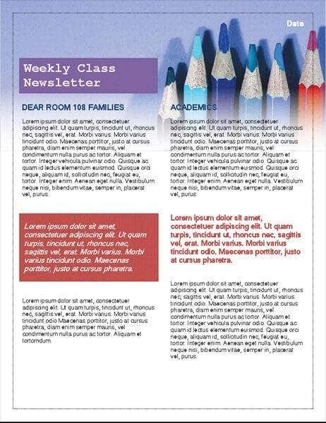
There are a lot of class newsletter templates that look like they were done as a kindergarten project, but this snazzy template from Microsoft manages to tread the line between crayon and crayon-inspired perfectly. It’s fun without being painful to look at, which many designers just can’t seem to grasp.If you’re a teacher who’d like to keep parents in the loop about what’s happening in their children’s daily school life, this template will both save you a lot of time and make your whole operation seem that much more professional.
School Newsletter – MS Office Templates
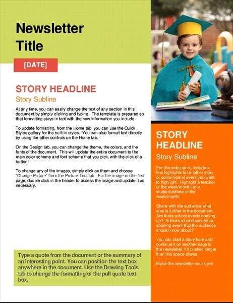
This school newsletter stands out for its bold use of colors, modern professional look and supreme readability. This design would actually work well for all sorts of use cases, where you want to have an official look without coming across as stuffy and boring.The story page is designed in such a way that you can easily clone it for longer newsletters, but if your newsletter is fairly frequent, this two-page free newsletter template leaves plenty of space to write concise stories for your audience.
Nonprofit Newsletter – MS Office Templates
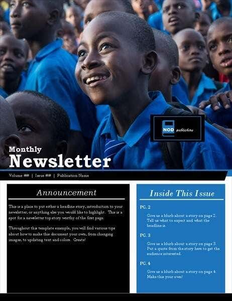
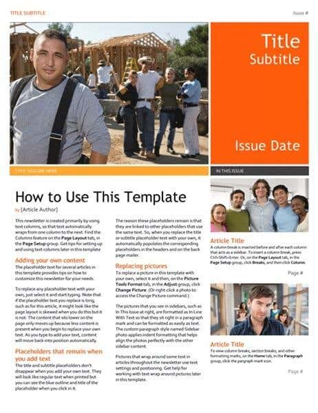
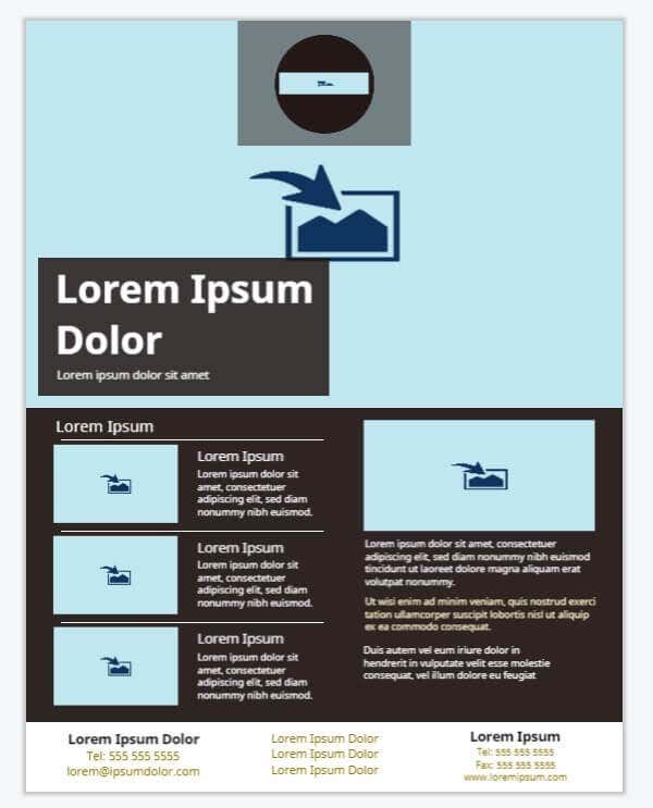
This template has a beefy download size, but it’s justified when you take into account how much went into this template’s design.Nonprofit organizations live or die by the grace of donors and potential donors. They have to get the message across quickly, while telling stories that inspire and engender sympathy. Existing donors need to know that their money is being put to good use and potential donors must be convinced of the same. This template nails it, especially since the front page prominently leaves a space for your most impactful picture and a beautifully readable summary of the contents inside. If you can’t grab someone’s attention with that, then we don’t know what to say.This free newsletter template would also work well for any aspirational type of project. Where the idea is to convey a sense of positivity. You should also consider matching the main color of the template to the main color of your chosen photo. It’s one of the main reasons this template works so well in the example.
Weekly Newsletter – MS Office Templates
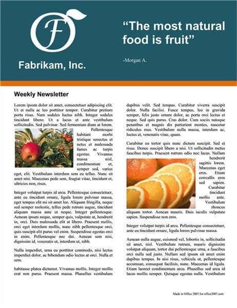
We’re not sure what makes this template a “weekly” newsletter, but that wonderful minimalist letterhead does so much with so little. If you have the right logo for it, this template evokes a health and wellness vibe that anyone from organic farmers to the local family-owned health food store could use.The color choice here is sublime and we’d recommend leaving the shade unchanged if you do opt to change the colors themselves.
Technology Business Newsletter – MS Office Templates
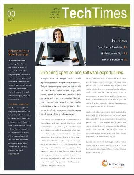
You have to hand it to the designers at Microsoft, they sure do know how to instantly communicate “tech newsletter” at a glance. It’s like they’ve done this before, or something.The layout is clean, with plenty of spots to insert interesting short bits of info. The secret to a good tech newsletter is to let readers easily pick and choose the information that’s most relevant to them. This template’s layout minimized the confusion while keeping it all slick and pleasant to look at.
Executive Newsletter – MS Office Templates
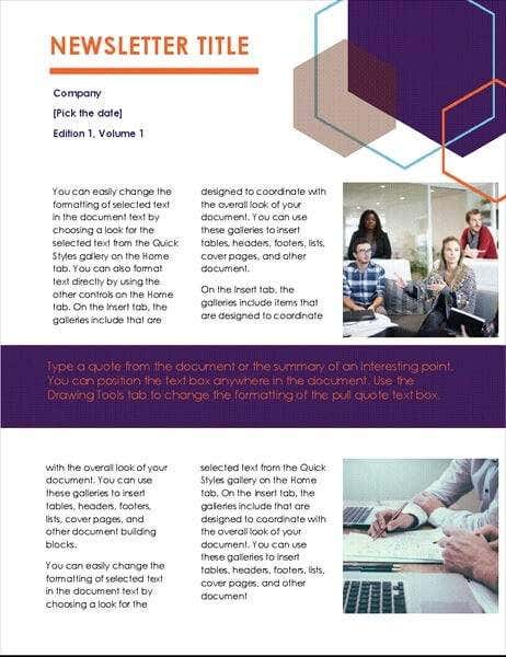
While this template is billed as an “executive” newsletter, we think it’s better suited to startups or crowdfunding projects. It has that hip look you’d expect from the disruptor set. It’s those cool geometric shapes that give it the not-quite-corporate tech-startup vibe. It’s especially perfect if you want to keep the hype going, but don’t want to give too many details away. This free newsletter template is low on space for story copy, but that’s OK if you don’t have much to say right now.
Newsletter (Bars Design) -MS Office Templates
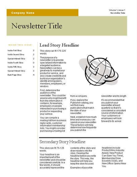
This has a retro-corporate vibe from the 90s that we just love. Maybe it’s ironic nostalgia talking, but this feels like reading a computer manual from the days of Windows 98. Your older tech audiences will appreciate it. Also, this is the perfect template if you don’t want to use any photos. We recommend replacing the graphics only with retro clipart of a similar design. Otherwise it spoils the whole thing.There’s tons of space for detailed stories here, yet the space has been used in such a way that nothing feels cramped. This is one of the best classic newsletter templates we’ve yet seen!
Restaurant – MS Office Templates
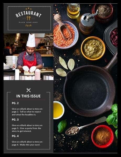
It’s amazing how a bit of visual language can evoke the other senses. You can almost smell herbs and spices from this template. Of course, if you have your own saucy professional food image for your foodie newsletter or food hospitality business then it will still go perfectly with the chosen typeface and color scheme – the included photos are however top-notch.The newsletter almost comes off as a menu from an upmarket eatery. Interestingly enough, some restaurants have taken to publishing their on mini-magazine slash menu, and this newsletter channels that style perfectly.
Newsletter – MS Office Templates
Rather cheekily, Microsoft has named this free newsletter template simply “Newsletter”, but looking at it that might be appropriate. This is quite possibly the most newslettery-newsletter on this list. All jokes aside, it’s a minimalist masterpiece. Text is neatly divided into efficient columns, with simple blocks of color and good font choices. It all comes together as the perfect generic newsletter. It’s even safe to change the default colors to whatever complementary shades you prefer. It won’t do anything to hurt the overall aesthetic. If you want a template that gives you plenty of room to clearly tell multiple stories and don’t want to waste any time customizing it, this is the template for you.
Newsletter (Black Tie) – MS Office Templates
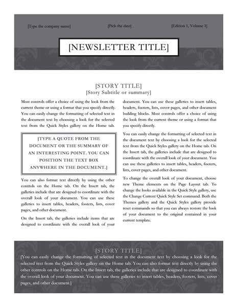
There’s a saying that goes “the medium is the message”, which basically means that sometimes aspects of a medium become associated with the typical messages of a time and place. Think about black and white films. When modern movie makers choose to make a film in black and white, it’s usually to evoke a sense of classic cinema. The people who made those classic cinema titles didn’t have a choice in the matter: color film hadn’t been invented yet.Which brings us to this “black tie” newsletter. If you’re looking to create a newsletter for your literature club or other artsy endeavor, then this newsletter has exactly the right mix of legibility and classic handbill design to keep things classy.As a bonus, you can cheaply print this design using a mono laser printer while losing nothing of the original charm.
Holiday Newsletter (Santa’s Sleigh & Reindeer) – MS Office Templates
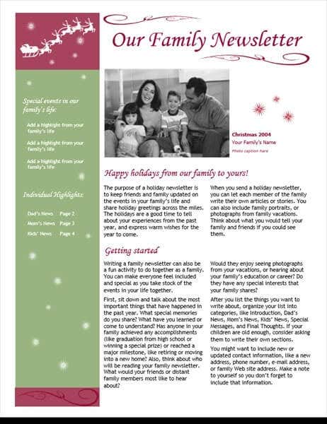
The holidays are tough when you can’t get to see all the family you want to, but with a nice newsletter you can keep the extended relations informed of what’s been happening in your lives. Sure, people have Facebook and other social media now, but a personal newsletter has that much more sentimental value.The problem is that looking through free newsletter templates with festive flair invariably means looking at incredibly ugly, garish designs. This template however, shows that you can keep the Santa without the Comic Sans and crayon art. It looks really classy, while still being filled with yuletide cheer. Even better, you don’t have to think up topics to populate it with. The template includes detailed ideas for what to include in each section.
Floral Newsletter – Brother Creative Center
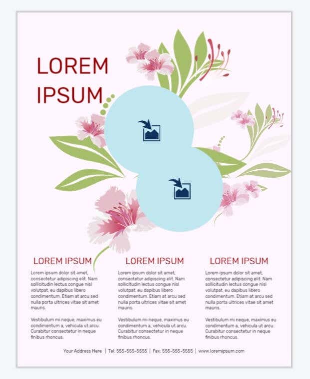
The above free templates from Microsoft are pretty easy to use. You simply have to download them as Word files and proceed as usual. While Brother has been nice enough to provide their newsletter templates for anyone to use, you also have to use their own online editor. Luckily it’s pretty straightforward and the resulting PDF is nice and crisp. Good for print or email.This particular newsletter provides a lovely floral backdrop, with space for two photos, cropped into circular frames. The suggested use is for something like a spa or other wellness business, but this one-page newsletter design could be good for any “softer” enterprise that wants to spread some quick information around to interested parties. It’s also eye-catching as a print flyer you can stack in-store or wherever people hang around and wait. Like a doctor’s office.
Hospitality & Tourism Travel & Hotels – Brother Creative Center
This is another corker from the Brother Creative Center. If you have or plan to have an AirBnB, then this is the perfect newsletter template to let people staying over know what’s available to do, and what the latest happenings are with your pad. It’s also perfect as a newsletter to email to people who have signed your visitor’s book over the years. With an eye on enticing them back for another stay. Of course, your photography game needs to be on-point, but if you’ve got the pictures for it, this is the perfect template to slot them into.
Hello Frost – Adobe Spark
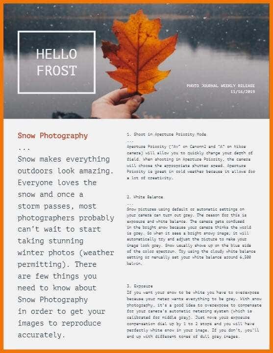
This is one of two Adobe Spark newsletter templates on this list. Like the ones from Brother, you need to use Adobe’s own online editor. In addition, unless you have a paid subscription, you’ll have to put up with a tiny Adobe Spark watermark in the corner of your newsletter. It really isn’t obtrusive at all however and given how nice some of these templates are, it’s a small sacrifice.Speaking of which, Hello Frost immediately caught our eye as the perfect template to show off your photography and let people know about the interesting places you’ve been and things you’ve seen. Of course, the default template has been designed with winter/autumn colors, but you can change that in a jiffy. It’s artsy, but still very readable and makes for a great choice if you plan on making frequent small releases.
Literature Monitor – Adobe Spark
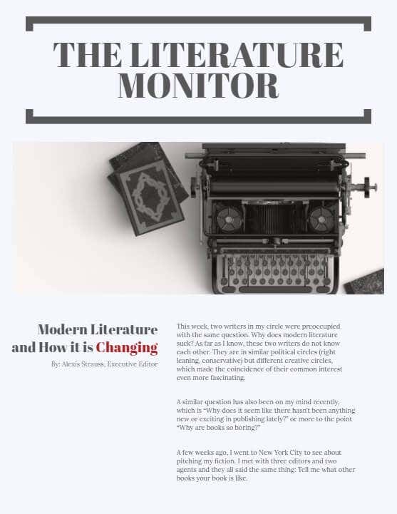
Do people even read anymore? Well, your friends do and they are just dying to hear what your latest thoughts are about the world of literature this week. If you want to evoke the smell and crackle of well-loved paper books, this template from Adobe Spark is just the ticket. You could imagine Hemingway himself grunting in mild approval if this was found in his postbox. Although, ironically, this highly-legible layout is best suited to those who can be parsimonious with the verbiage. If you get what we’re saying.
Extra! Extra! Read All About it!
Wow, what a treasure trove of snazzy, free newsletter templates for every occasion. Tweak them to your taste and then enjoy the money you’ve saved on hiring a graphic designer, while making everyone think you’ve gone pro with your publication. The actual writing is all on you however, we can’t help you with that.
