RelayThat is part of a growing tribe of online graphic tools. It joins familiar names such as Canva and Stencil. In short, you are spoilt for choice when it comes to do-it-yourself branding innovations with your own image assets. You just have to decide which online graphic editor suits your skill levels and pocket. So, let’s take an inside look at what RelayThat is and what it offers for your in-house design needs. We’ll also compare it to Canva and other similar alternatives. Plus, RelayThat is offering an exclusive 15% discount for Online Tech Tip readers.
RelayThat: The First Look
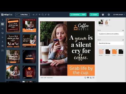
Like all online graphic tools, RelayThat simplifies the design creation process. On one end, you have the industry standard Adobe’s Creative Cloud and its complicated Digital Asset Management Workflows. Then, you have online alternatives to Photoshop and Illustrator like PicMonkey and Vectr that are far simpler. What if you want to make it even more effortless? RelayThat is just such a solution. It can help you start on your branding innovations the second you log on. You don’t need magic design skills. RelayThat suggests there’s no right or wrong path to find the perfect design. This introductory video is a quick walkthrough of the tool:Now, let’s highlight some key features that make this app worth your while:
The Layout Explorer
RelayThat uses a vast template library (the Layout Library) as a starting point. The templates follow the brand guidelines of different industries. There are more than 2000+ smart layouts on offer. You can make logos, banners, posters, images, brochures, infographics, business cards, and any other digital asset you can think of. You can also prepare graphics for different channels like social, advertisements, print, and even unique uses like Audio Covers and YouTube stills.
Responsive Layouts
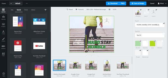
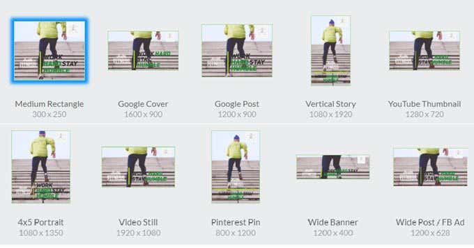
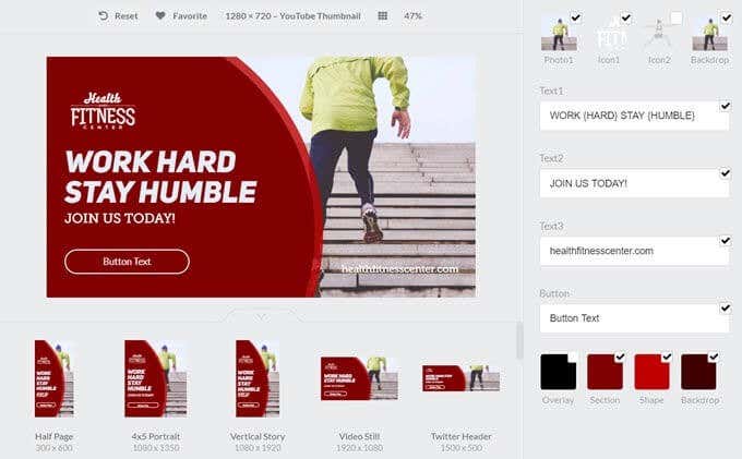
Browse all the available pre-built responsive layouts and choose one to match your brand. You don’t have to keep up with standard dimensions of social media headers and other layouts. The service supports 50+ of the most popular sizes. All assets can be customized with color, font pairing, headline styles, and other presets.
Idea Presets
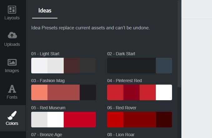
Not all of us can combine colors with the eye of a Picasso or even pair fonts for impact. RalayThat’s Idea Presets is a nice one-touch color swapping and font fairing feature. Just click on the palettes to choose between different color variations of your starter template.
The Workspace
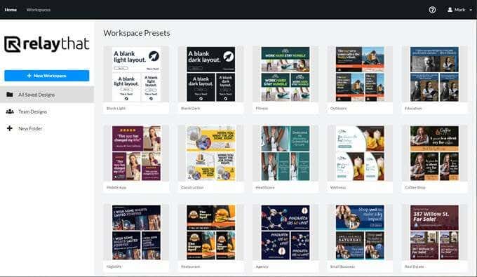
RelayThat then helps you put it all together in a specific “Workspace“. Use workspaces to organize all the assets you want to work on for a single brand. These can be collaborative folders for your entire team, and you can seamlessly switch between different workspaces for different projects anytime.
Magic Import
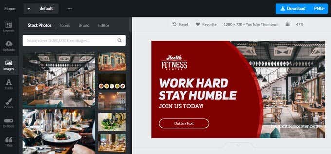
Magic Import is a nice feature you can use in a workspace to set up all your site’s assets quickly. You don’t have to individually download each file. Use your site’s URL to grab everything. Select the graphics you want to use. Then, use the smart layouts to rearrange them in the workspace.
How Does RelayThat Stack Up Against Canva?
RelayThat will be benchmarked against the category leading Canva. Canva packs more features, as it is a mature platform now. This can be intimidating and slower for you if you want to jump straight into designing. Both Canva and RelayThat have templates. Canva allows you to start from scratch too and has more features for fine tuning designs. Canva allows you to create layouts with custom dimensions. This freedom is great if you have moderate design skills. If you’re a design newbie, RelayThat feels simpler for beginners because of its templates-first approach. This simplicity also makes it feel more intuitive. With a single click, RelayThat can mix and match your basic assets and give you hundreds of design alternatives. You can use this feature to create several variations of your original design faster than you can in Canva.But let’s not mistake it for your average cookie cutter design tool. RelayThat, like Canva, is a branding tool that supports a huge library of templates and stock photos. Canva offers free downloads from massive stock photo sites like Pexels and Pixabay. RelayThat isn’t far behind as it offers 3 million copyright-free photos (add 100K icons) to all subscribers. In both, you can upload your own images too. Both Canva and RelayThat offer digital asset management features for teams. Canva calls it a Brand Kit while RelayThat gives you Workspaces. But how much do all features cost you?
RelayThat Vs. Canva: Pricing Comparison
RelayThat has two pricing tiers. The Pro plan costs $25 per month. The Enterprise plan is a variable plan based on team numbers. Canva offers more pricing options with its freemium model. You can keep working on the free version of Canva. When you want to go Pro, there is a 30-Day trial. Pro subscriptions cost $9.95 per month.
Take a Look at Other Branding Tool Alternatives
It’s a big space with other online design tools trying to get your attention. Stencil and PicMonkey are two other names you will come across.
PicMonkey
PicMonkey is a solid image editor that works in your browser. It offers templates and design assets for your site and for social, but it’s more of an online photo editor. You can use features like layers, background remover, textures, gradients, filters, and more to customize photos. It’s not the best alternative to RelayThat (or Canva) if you want to create many images quickly and without too much effort. Choose it if you want more control but not something like Photoshop with its steep learning curve.
Stencil
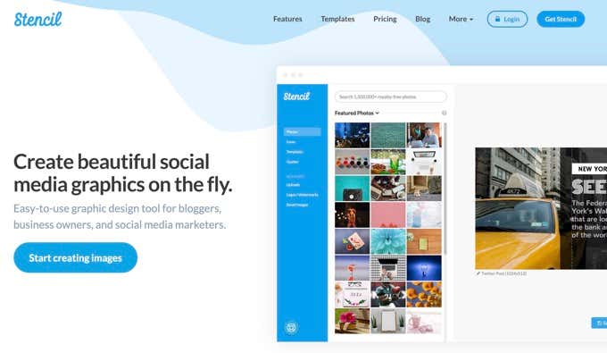
Stencil is a capable alternative to RelayThat. It’s also designed for speed and simplicity. Stencil has a huge library of free stock photos, icons, Google Fonts, and templates. You can use 75+ size presets for social media images, web banners, ads, YouTube channel art, blog headers etc. Like those quotes images? Search from over 100,000 quotes right inside Stencil and make stunning images with a click. Stencil also supports social media scheduling via Buffer. Choose Stencil if you want to focus on social media with appealing graphics (especially quotes).
Choose RelayThat for Simpler Design Needs
Now, that you have taken a walkthrough, let’s glance at the Pros and Cons once more:
Pros:
Fast and intuitive features allow you to design an image in five minutes or less.No learning curve as you start with pre-designed templates in standard dimensions.Brand management is easier as all assets can be imported and placed on the right templates quickly.One click option to create multiple variations of a graphic with the core brand assets. Includes a rich library of images and thousands of icons.
Cons:
Lack of customization options is a handicap for good designers.A feature to add new placeholders to the templates is absent.The interface with fixed panels and work area is not customizable. Font options are limited, with no kerning or extra font effects. No video tutorials and tips to help the beginner.
Overall Rating: 4 out of 5Ease of Use: 4 out of 5Flexibility: 3 out of 5RelayThat is for a certain type of user. But at the end of the day every branding tool is different with different value propositions. The best way to know is to try them out. Design a prototype of your brand image on all design platforms you shortlist. This simple exercise will help you drill down to the right design tool for your visuals so you can start work on building a steady online presence.
