What Is a Histogram?
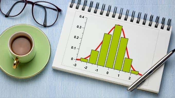
A histogram is a type of chart that uses vertical bars to summarize ranges of data. While it may look like a bar chart, there are significant differences. Bar charts show the differences among variables, whereas histograms are generally used to show the differences among variables in terms of another variable.To illustrate, a histogram may be used to show us how common ranges of IQ scores are. Each bar represents a “bin” or range of scores. So something like 0-10,11-20, etc. The vertical Y-axis shows us how many measurements of that variable fall within each bin range. So if you have 100 people write an IQ test, every person whose score falls within a particular bin is counted towards the frequency score of that bin.With a bar chart, you might want to compare something like average IQ scores between countries. In this case, each bar might represent a country and the vertical Y-axis would represent the average IQ of that country.
When Should You Use a Histogram?
HIstograms are a visualization of frequency distribution. It can help you see, at a glance, what sort of distribution your data has. For example, the “Normal Distribution” has the distinctive bell-curve look. A bimodal distribution will have two bumps. You can also see if score frequencies are skewed one way or another. Of course, if you really want to determine whether your frequency distribution is normal or not, you’d run a normality test in Excel on your data. Those tests still use histograms as a basis though and creating and observing a histogram is a crucial first step in showing you roughly what sort of distribution you may be dealing with.
What You Need To Make a Histogram
In order to make a histogram, you need a few things:
A set of measurements for a single variable.Defined “bins” of value ranges.
The first requirement is fairly straightforward. For example, if you have the weights of a group of people, you’d have each measured weight recorded in your dataset. Be careful not to mix the data from groups you don’t want to measure together into one histogram. For example, if you only wanted to look at the weight distribution of a certain age group or gender, you should only include data for that group.If you wanted to compare the frequency distributions between two groups on a single variable, you’d need multiple histograms. One for each population group.
All About Bins
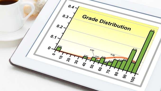
The next requirement is the trickiest. You need to decide on the “bins” that your frequency counts will be sorted into. The problem is that these may be arbitrary. If you’re going to look at the frequency of scores between 0 and 100, you could have 100 bins, one for each possible score. However, that means 100 bars in your histogram. That’s a finely-grained distribution, but it’s probably not all that useful. In the case of test scores, you’re in luck since there are already “bins” in the form of grade symbols. So you could arrange your bins to coincide with those. However, for other types of data you have to invent the bin ranges.Spend some time considering how you’d like to divide scores into bins and whether the histogram will paint the picture you’re looking for if you decide on a particular “bin width”. You can also choose to leave it to an automatic function in Excel, where it will try to decide on a bin width that’s best suited to your data. In Excel, you can also specify the number of bins, which includes optional so-called overflow- and underflow- bins. These capture all scores over and under a specified value.
Creating a Histogram in Excel: Step-by-Step
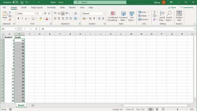
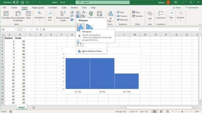
Creating a histogram takes just a few clicks. We’re using the latest version of Microsoft 365 here, but any version of Office starting with 2016 will work the same way.
Create the Histogram
Customize the Horizontal Axis
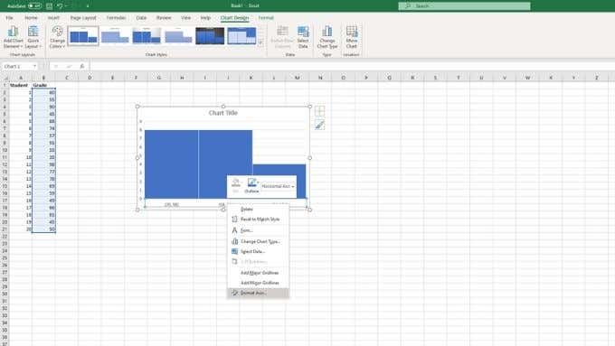
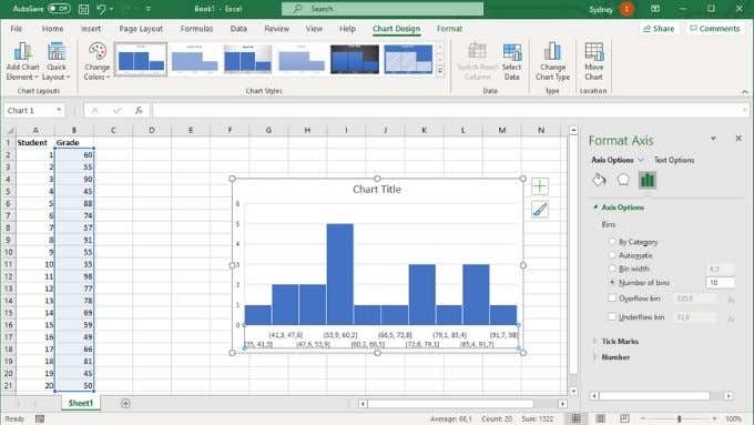
Now your histogram is in the sheet, but it probably doesn’t look the way you want it to. So next, we’re going to customize the horizontal axis:The format axis pane will now be open. There are a number of important options here that you can use to tune your histogram so that it looks exactly like you need it to.Under Axis Options, you can customize the bins we discussed earlier. The two most important settings here are bin width and the number of bins. These options are mutually exclusive. If you specify a bin width in numbers, the number of bins will change automatically and vice versa. You can choose to activate overflow and underflow bins here as well.
From Hysteriagram to Histogram
Hopefully you can now make a histogram easily, but if you need to review basic Excel concepts, try reading Microsoft Excel Basics Tutorial – Learning How to Use Excel
